How to read stock charts: Learn the basics


Stock charts and their accompanying data can appear complex and may be difficult to understand for new investors. The good news is that with a little help, these charts — and the information they contain — can be useful during your research process to more easily identify attractive investment opportunities.
By understanding the basics of how to read a stock chart, you’ll be able to analyze new stock ideas more quickly and choose which investments are worth digging into further.
Here are the basics on reading stock charts for beginners.
How to read a stock chart
Stock charts can vary depending on the platform you’re using to view them, but you can usually find them on stock quote pages or on your online brokerage account (or app). Several financial websites even offer them for free.
The example below of an Apple (AAPL) stock chart comes from Google Finance:
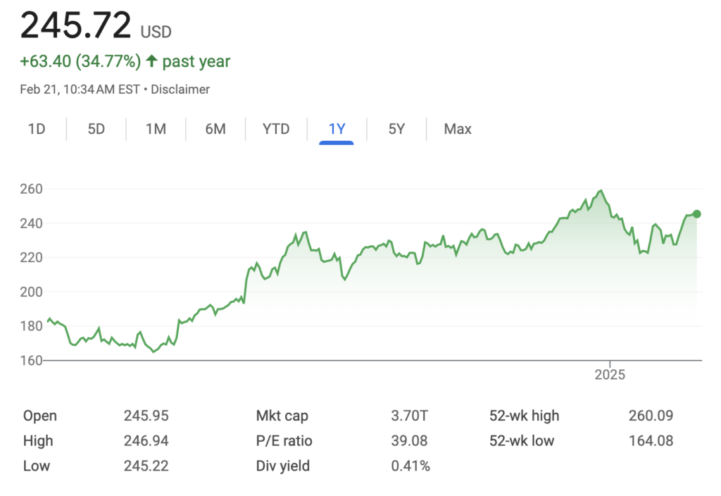
The chart
Looking at a stock chart is one of the easiest ways to get a sense of how the stock’s price has performed over a certain period of time. With price per share on the y-axis and time on the x-axis, you can quickly see where the stock has been trading. The top of the chart lets you select different time periods to evaluate.
The big number in the top left is the current price per share ($245.72). Just to the right, you can see how the stock has changed over the time period you’ve selected. You can see Apple shares have increased by $63.40, or nearly 35 percent, over the past year.
One cool feature of Google Finance charts is that the chart line turns green or red based on the stock’s performance during the period of time you’re looking at. In the example above, Apple’s stock rose over the prior 12 months, so the chart is green.
Looking at the long-term price chart is likely to give you the best sense of how the business has performed. Stock prices can do just about anything in the short term, but over time they tend to reflect the performance of the underlying business.
Stock chart data basics to know
There is typically data that accompanies any stock chart that you’ll come across. Analyzing this data and knowing what the underlying business performance of a stock is can help you make informed decisions about whether to invest. Here are definitions of the most common stock market terms you’ll find.
- Open: This amount refers to where the stock’s price opened for trading on that given day.
- High/low: These numbers are the highest and lowest prices that the stock traded at on that day.
- Market cap: This figure refers to the company’s market capitalization, or the value of all the company’s outstanding shares. You can think of it as what it would cost to buy the entire company at the current price.
- Price-to-earnings (P/E) ratio: This number is a valuation ratio and looks at where the stock price trades relative to the company’s annual earnings. The P/E ratio is one of the most popular tools in investment analysis and helps investors determine whether a stock is appropriately valued.
- Dividend yield: This figure is calculated by taking the annual dividend per share and dividing by the current share price. Dividends are a way for companies to share profits with shareholders.
- 52-week high/low: These are the highest and lowest prices the stock has traded for in the past year. Some investors like to look for undervalued stocks on lists of companies trading near their 52-week lows.
Other stock market terms that may come up
As mentioned above, stock charts can be different depending on where you’re viewing them. Here are some other terms that you may come across when you’re looking at stock charts and researching companies.
- Volume/average volume: Volume refers to the number of shares that have been traded on a given day. You may also see numbers for average volume, which shows the average daily volume over some period of time, such as 30 days. Most large companies trade millions of shares each day.
- EPS: This abbreviation stands for earnings per share, which measures how much a company made in profit per share.
- Ex-dividend date: This refers to the date by which you must be a shareholder in order to receive the company’s next dividend payment. If you don’t own the stock by this date, you won’t get the next dividend.
- Beta: This numerical value is used by some investors to measure the riskiness of the stock based on its underlying volatility. Shares with a beta above 1 have been more volatile than the overall market over the specified time period, while a beta below 1 means shares have been less volatile. Not all investors agree that share price volatility is the best indicator of risk.
- One-year target estimate: This value is an estimate of where the stock price will be in one year and is typically based on an average of several analyst estimates. This number should not be overly relied upon, as many forecasts turn out to be wrong.
Bottom line
Stock charts and the data that comes with them can be useful tools when you’re researching a new stock idea. Once you get the basics down, you can quickly glance at many different charts and take in a lot of key information.
Though stock charts often highlight how volatile prices can be — especially over short time periods — keep in mind that the key long-term driver of a stock’s price is the underlying company’s earnings and cash flow. A stock can ultimately only be as successful as the business itself.
— Bankrate’s Logan Jacoby contributed an update to this story.
Editorial Disclaimer: All investors are advised to conduct their own independent research into investment strategies before making an investment decision. In addition, investors are advised that past investment product performance is no guarantee of future price appreciation.
Why we ask for feedback Your feedback helps us improve our content and services. It takes less than a minute to complete.
Your responses are anonymous and will only be used for improving our website.